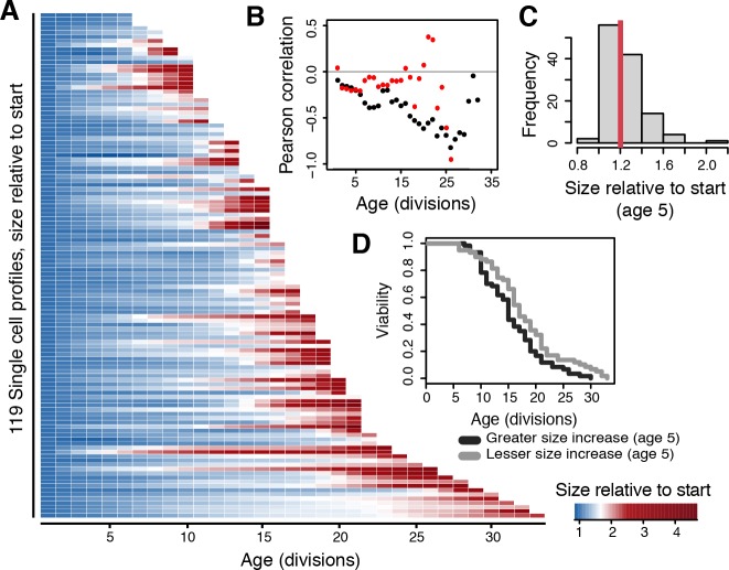
Fig 3. Early life increase in cell size reflects lifespan potential of single cells.
(A) The amount each cell has increased in size at any given age. Cell size increase is represented as color intensities, measured in terms of fold increase relative to starting size. (B) Pearson correlations comparing the observed population lifespans to cell size increase at each respective age in the complete dataset (black dots) and in all pre-SEP datapoints (red dots). (C) The frequency distribution of amounts of cell size increase in the population at age 5. Red line indicates the median, an increase of 1.2 times the starting size. (D) Lifespan curves of cells that have increased less in size (grey line, 59 cells, median RLS of 17) or more in size (black line, 60 cells, median RLS of 15) than the median of the population at age 5 (p-value = 1.7 x 10⁻²).

