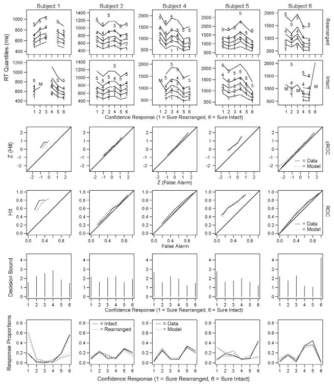
Fig. A1.
Experiment 3: Data and model fits. The first two rows plot the RT quantiles for each confidence response with the 6 response keys plotted on the x-axis (the “sure rearranged” category is labeled 1 and the “sure intact” category is labeled 6) and the RT quantiles plotted vertically with each line representing a reaction time quantile. The numbers plotted represent the empirical data and the lines represent predicted data from the model. In conditions where subjects made between 4 and 10 responses the median RT is plotted as an ‘M’ and the other quantiles are not included. Conditions where subjects made fewer than 5 responses are omitted from the figure. In conditions where the model predicted between 5 and 10 responses only the median RT is plotted and the other quantiles are not included. Conditions where the model predicted fewer than 5 responses are omitted from the figure. The third and fourth row in each figure plot the empirical and predicted z-ROC and ROC curves for each subject. The solid lines depict the empirical data and the dashed lines depict the model predictions. The fifth row plots the decision boundaries for each confidence response and the sixth row plots the response proportions (both empirical data and model predictions) for each confidence response and condition. The solid lines depict the empirical data, the dashed lines depict the model predictions, the black lines depict responses for ‘intact’ pairs and the gray lines depict responses for ‘rearranged’ pairs.

