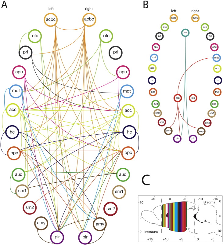
Fig. 3.
Connectivity graph shows higher connectivity in kainate-treated than saline-treated group.
Connectivity graph for A: Isoflurane 1.5%, B: Isoflurane 2.0%, C: Approximate coronal location for the ROI (color coded). The circles with labels represent brain regions (nodes) and the line represents a significant connection between the two nodes. This sub-network was thresholded at t ≥ 3.5, with P < 0.05. See Table 1 for node abbreviations; left and right pairs of a region are illustrated.

