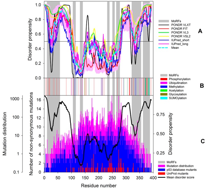
Figure 10.
Distribution of intrinsic disorder propensity (A); PTM sites (B) and pathological mutations (C) within the sequence of human p53. In plot (A), disorder profiles are generated using PONDR® VLXT, PONDR-FIT, PONDR® VL3, PONDR® VSL2, and IUPred. The bold cyan dashed line shows the mean disorder propensities calculated by averaging the disorder profiles of individual predictors. The light pink shadow around the PONDR® FIT shows the error distribution. In all plots, the positions of disorder-based binding sites (molecular recognition features, MoRFs) found by the ANCHOR algorithm are shown as gray shaded areas. Plot (C) shows the sequence distribution of pathological mutations (pink bars; note the semi-logarithmic scale of this graph) and the abundance of different non-synonymous mutations (blue bars) in the UMD TP53 mutation database (http://p53.fr/), and distribution of pathological mutations annotated in UniProt (red bars).

