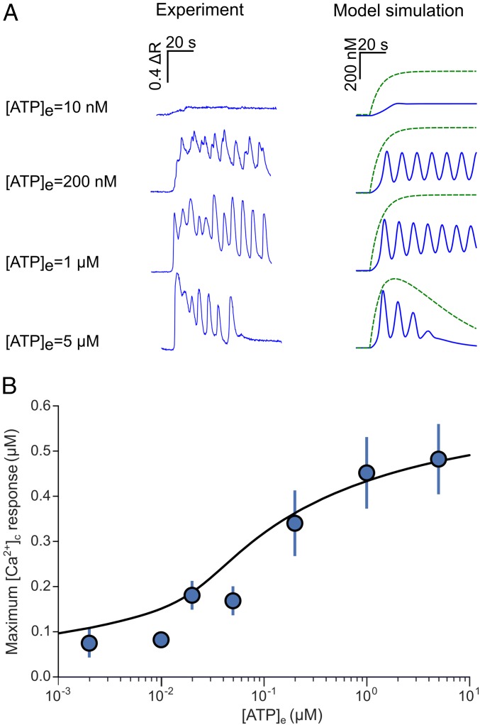
Fig. 2.
ATP-evoked Ca2+ oscillations: comparison between experiments and simulations. (A) Representative traces recorded from individual nonsensory cells (Left) and corresponding model simulations (Right) for three different [ATP]es; blue traces are for [Ca2+]c and green for [IP3]c. (B) Ca2+ dose–response curve for ATP. Each data point represents the average peak [Ca2+]c response of at least 30 nonsensory cells in three different cochlear organotypic cultures; solid line shows model fit to the data.

