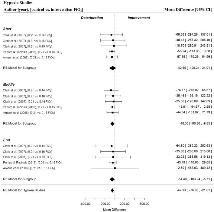
Figure 3.
Forest plot for hypoxia meta-analysis illustrating power output during start, middle and end sections compared to normoxia trials. Squares represent individual study mean difference and the lines represent 95% CIs. The size of the square is proportional to the weight of the study within the meta-analysis. The diamond represents the overall mean difference for each split with the width of the diamond signifying the 95% CIs.

