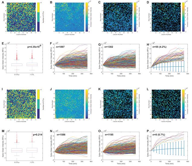
Figure 4. Overall analysis of cytotoxicity on microraft arrays.
Two arrays are compared: the first with M1p-pulsed DCs as targets (Figure 4A-H) and the second PR1-pulsed DCs as targets (Figure 4I-P). The fluorescence measurements for each microraft are shown in processed 70 × 70 array images (Figure 4A-D, 4I-L), where each box represents the appropriate fluorescent measurement for 1 microraft. T cells distribute evenly across the arrays with some microrafts having 0, some having 1 and some having >1 CTL present, measured by enumerating the numbers of segmented far-red labeled cells per microraft (Figure 4A, I). After 6 h, both arrays have a modest increase in green fluorescence (cell death) throughout the entire array (Figure 4B, J). Comparisons were made between the green fluorescence produced in microrafts with 0 CTLs and those with 1 CTL. In these representations only microrafts with the appropriate numbers of CTLs (i.e. 0 or 1) are colored. Quantified green fluorescence at t = 6 h (minus green fluorescence at t = 0 h) for microrafts with 0 CTLs (Figure 4C, K) and 1 CTL (Figure 4D, L) is shown with the other microrafts represented in black. The differences in mean fluorescence change between microrafts with 0 and 1 CTL were small, but statistically significant for the M1p array (Figure 4E) but not the PR1 array (Figure 4M). The array can measure the change in green fluorescence per microraft during the time course of the experiment. The fluorescence over time traces for all of the microrafts with 0 CTLs (Figure 4F and N) and 1 CTL (Figure 4G, O) are shown. The microrafts with the “best killers” were identified as having 1 CTL with green fluorescence > 4 median absolute deviations above the median (denoted by the light blue bars) at all time points. There were 55 of these microrafts on the M1p array and 8 on the PR1 array (Figure 4H, P).

