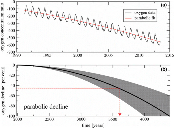
Fig. 2.

a The change in oxygen concentration ration over time recorded at ‘Alert Station’ in Canada, with a parabolic fitted decay curve [9]. b The projected decline based in oxygen concentration over time, using data from nine recording station in the Scripps Programme [9]. The uncertainty of the projection, based on the nine observational records around the globe, is shown in the grey shaded area. The red dotted line denotes lowest oxygen concentration likely to be tolerated by humans and time from now at which this will occur.
Both figures reproduced with permission from [9]
