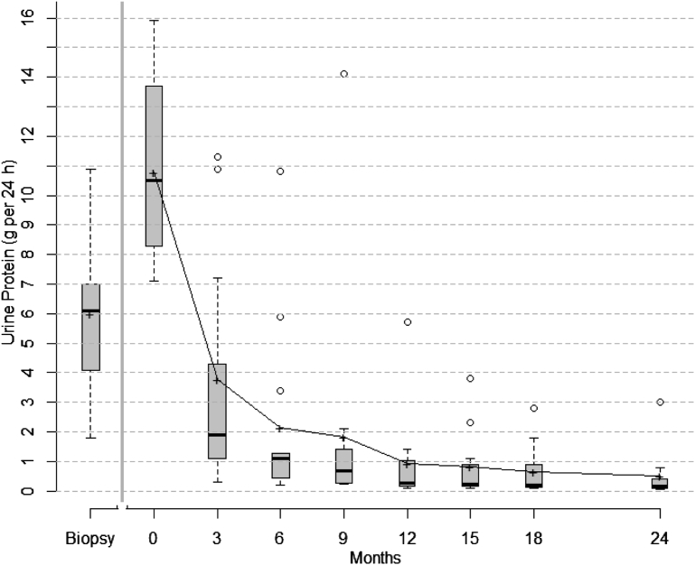
Figure 1.
Box plots of urinary protein excretion from time of diagnosis (biopsy) to study initiation/enrollment (time 0) to 24 months. Proteinuria increased during the observation phase (from diagnostic biopsy to time 0). After initiation of therapy, there was a rapid reduction in proteinuria within 3 months. The top and bottom of the box are the estimated 75th and 25th percentiles, respectively. The horizontal lines and “+” signs within each box represent the median and mean values, respectively. The vertical dashes denote the largest as well as the smallest data point that is within 1.5 times the interquartile range (75th to 25th percentile) above the 75th percentile or below the 25th; data points outside of this range are denoted by open circles. After relapse, patients were treated off protocol. Outcomes and efficacy data of relapsed patients from that point forward were not included in the analysis.

