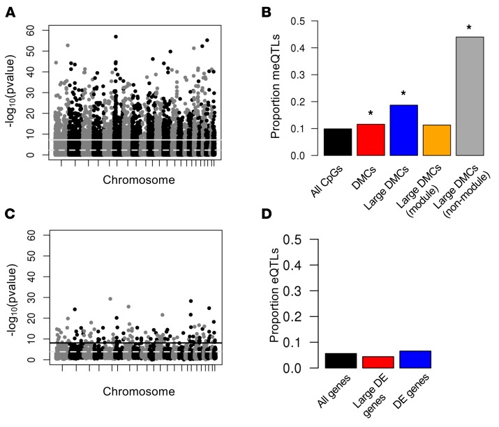
Figure 2. QTL mapping of methylation (meQTL) and expression (eQTL) levels.
(A) Manhattan plot showing the association P value between each SNP and methylation levels at nearby CpGs. The solid line shows the Bonferroni significance threshold; the dashed line shows the threshold at a FDR of 5%. (B) The proportion of meQTLs present in subsets of CpGs. Only the most significant meQTL per CpG is included. The black bar indicates all CpG sites on the array with a nearby SNP; the red bar indicates differentially methylated CpGs (DMCs) with a nearby SNP; the blue bar indicates DMCs with effect size >5% and with a nearby SNP; the yellow bar indicates DMCs with effect size >5%, a nearby SNP, and in a WGCNA comethylation module; and the gray bar indicates DMCs with effect size >5%, a nearby SNP, and not in a WGCNA comethylation module. *P < 2.2 × 10⁻¹⁶ compared with black bar. (C) Manhattan plot showing the association P value between each SNP and expression levels at nearby genes. The solid line shows the Bonferroni significance threshold; the dashed line shows the threshold at a FDR of 5%. (D) The proportion of eQTLs present in subsets of genes. Only the most significant eQTL per gene is shown. The black bar indicates all genes sites on the array with a nearby SNP; the red bar indicates differentially expressed (DE) genes with a nearby SNP; the blue bar indicates DEs with a >1.2-fold difference and with a nearby SNP.

