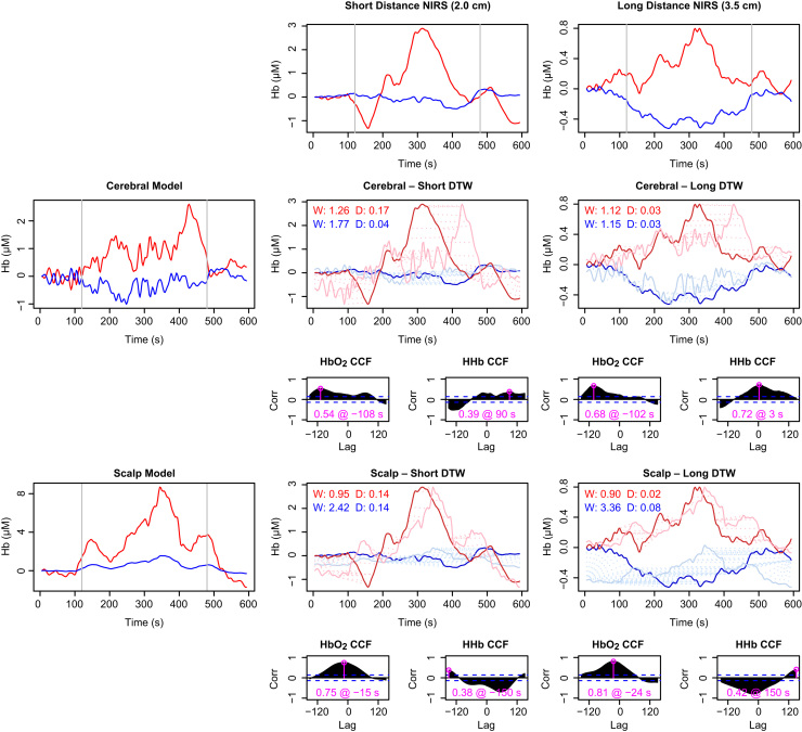
Fig. 8.
Comparison of NIRS data with model predictions for subject S8, showing a ‘normal’ response recognised as functional activation. Recorded haemoglobin signals at short and long source–detector separations are shown in the top row. Model predictions for the cerebral and scalp compartments are shown in the left column. Pairwise comparisons are shown in the corresponding rows and columns in the remainder of the figure. For each pair, the main plot depicts dynamic time warp (DTW) results for both ΔHbO2 and ΔHHb, while the two smaller plots below show the cross-correlation (CCF) between the real and modelled data for lags of up to 2.5 min. The maximum correlation, and the lag at which it occurs, is marked in pink on each CCF plot. In the DTW plots, the bold traces show the measured data and the fainter ones the (rescaled) model outputs. The dashed lines connecting the two show the warping between the two signal—longer lines thus indicate a poorer fit. The degree of warping (W) and final distance (D) are noted on the DTW plots in red for and blue for HHb (for both metrics, smaller is better). Notably, the scalp model predicts ΔHbO2 better at both distances, but predicts ΔHHb very poorly. The modelling suggests this data set does indeed exhibit activation.

