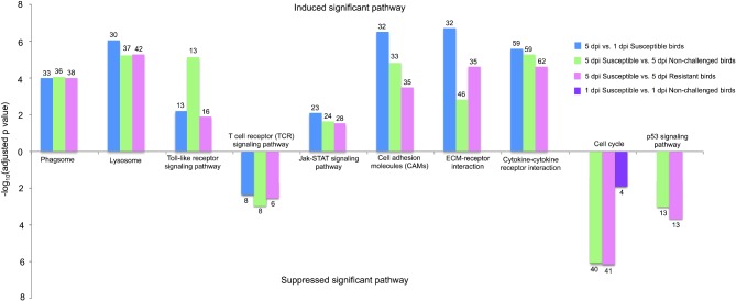
Figure 4.
Significantly changed pathways in different contrasts. The upper bar chart means the significantly induced pathways while the lower bar chart indicates the significantly suppressed pathways. The Y axis is adjusted P-value, which is processed by the –log 10. The number on the bar chart represents the numbers of the significantly differentially expressed genes that are involved in the induced or suppressed pathways. dpi, d post infection.

