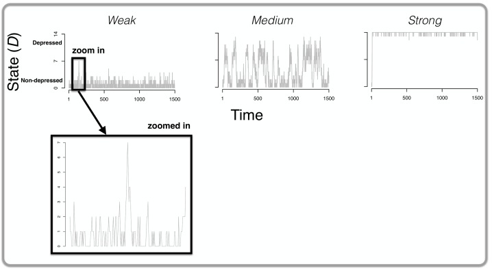
Fig 4. The results of Simulation I.
The top of the figure displays three graphs: in each graph, the state of the system D (i.e., the total number of active symptoms; y-axis) is plotted over time (the x-axis). From left to right, the results are displayed for a weakly, medium and strongly connected network respectively. For the network with weak connections, we zoom in on one particular part of the graph in which spontaneous recovery is evident: there is a peak of symptom development and these symptoms spontaneously become deactivated (i.e., without any change to the parameters of the system) within a relatively short period of time.

