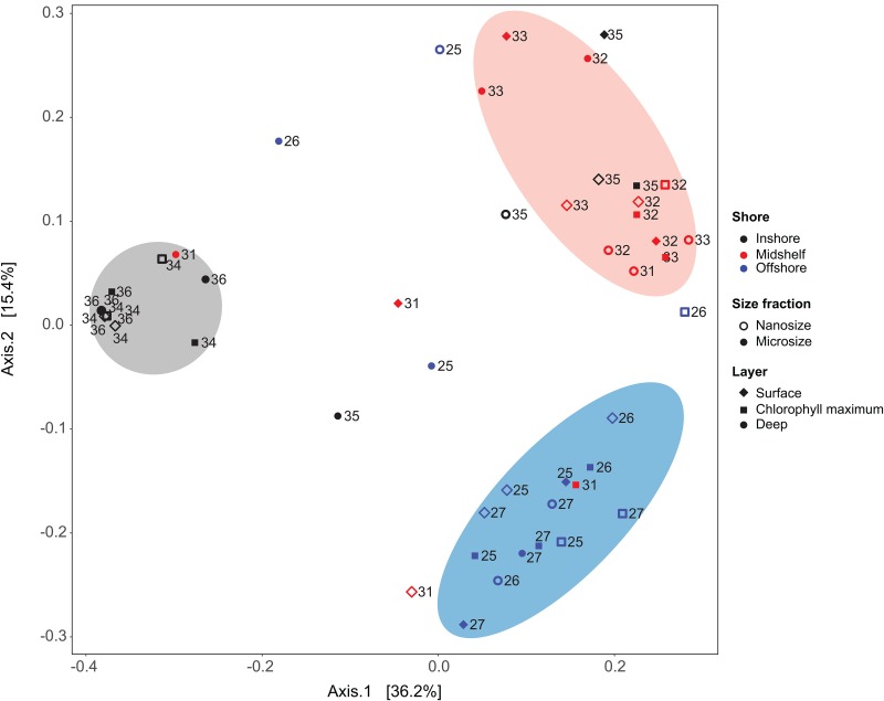
Fig 5. Principal coordinate analyses using Unifrac dissimilarity metric (HTS data) reveals three clusters emerge that generally correspond with inshore (gray), midshelf (red) and offshore (blue) samples.
The clusters show some overlap between midshelf and offshore (red symbols within the blue cluster), and between the midshelf and inshore (red within the gray cluster), but little overlap between inshore and offshore.

