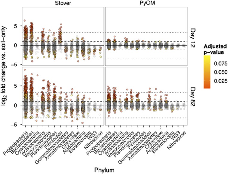
Figure 4.
Log2-fold change in relative abundance of OTUs as compared with unamended plots. Each circle represents a single OTU and dashed and dotted lines represent increases or decreases of 2x and 10x, respectively. Colors are scaled from yellow to red in decreasing P-value, with gray points indicating OTUs with Benjamini and Hochberg (BH)-adjusted P-values>0.10. The color reproduction of this figure is available at the The ISME Journal online.

