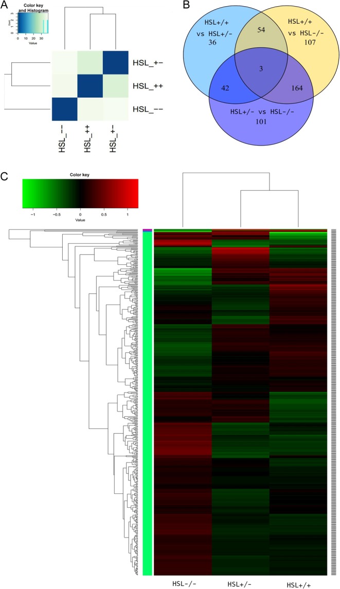
Figure 2.

Analysis of differences among the groups. (A) Entire genetic correlation analysis among HSL−/−, HSL+/+ and HSL+/−. The similarity between groups meets experimental design expectations. The similarity between HSL+/+ and HSL+/− is greater than HSL−/−. (B) Venn diagram of DEGs of each genotype group, created using Venn diagram software. Different numbers indicate DEGs between groups. Circles represented with different colors were compared between the three genotypes. Definition of differential expression genes by Cufflinks, P < 0.01. (C) Cluster analysis between samples. Each column represents a genotyping sample. Each row represents a gene. Red indicates higher expression, and green indicates lower expression. A gene-clustering tree is shown on the left with h-cluster clustering. A sample-clustering tree is shown at the top. As the distance between branches decreases, the similarity in expression increases.

 This work is licensed under a