Figure 1.

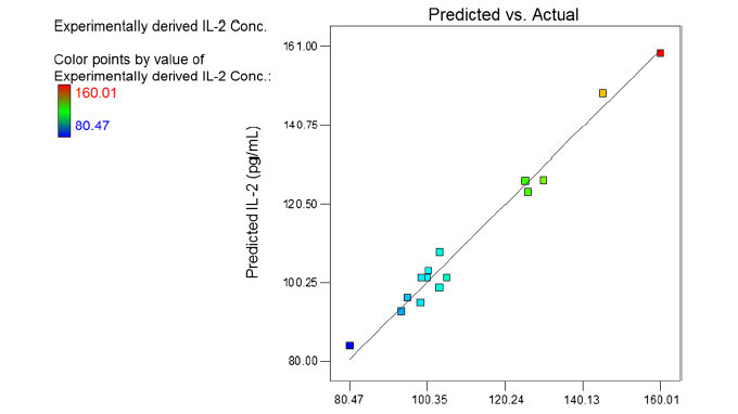
Parity plot showing the distribution of predicted vs. experimental values of IL-2 secretion. The bar in the left hand side of the figure indicates the changes from low (blue) to high (red) values.

Parity plot showing the distribution of predicted vs. experimental values of IL-2 secretion. The bar in the left hand side of the figure indicates the changes from low (blue) to high (red) values.