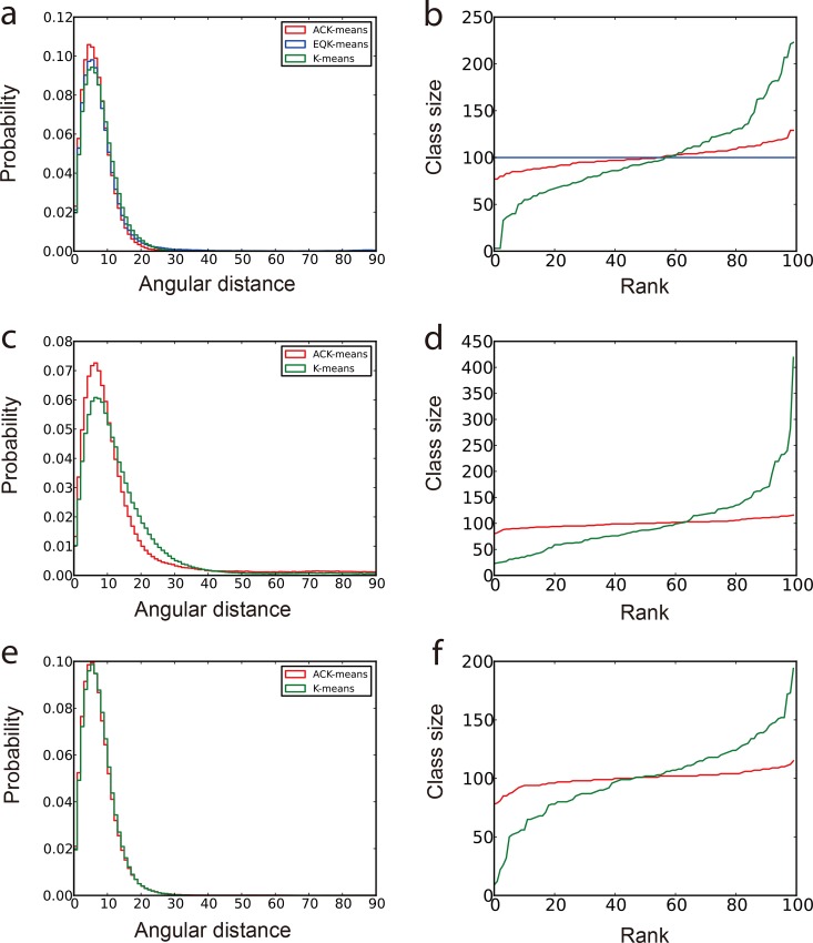
Fig 1. Comparison of classification results of simulated data with SNR = 1/10.
The First column (panels a, c and e) is the normalized histogram of angular distances. More accurate classification produces curve with higher peak concentrated at lower angular distance. The second column (panels b, d and f) shows the class sizes arranged in an ascend order. The most balanced classification has a horizontal line in this plot. (a) and (b) are from experiments using different clustering algorithms in MRA approach under SPARX. (c) and (d) are from experiments using different clustering algorithms in MRA/MSA approach under EMAN2. (e) and (f) are from experiments using different clustering algorithms in RFA approach under SPIDER. In all graphs, red curves present the results from the ACK-means algorithm.

