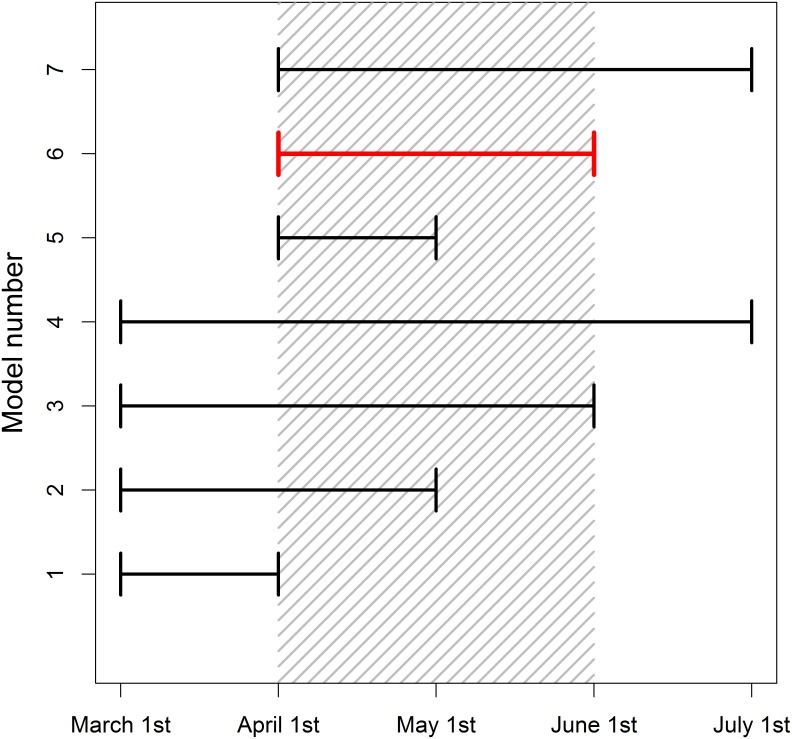
Fig 1. Illustration of a sliding window approach.
Shaded region represents a climate signal (April 1st—June 1st), where a climatic predictor has the strongest impact on the biological response. Each line represents a tested climate window. The start and end time of windows is varied until we identify the best window (in red). This figure demonstrates a sliding window analysis conducted at a monthly resolution, but such analyses can use finer scale daily data.

