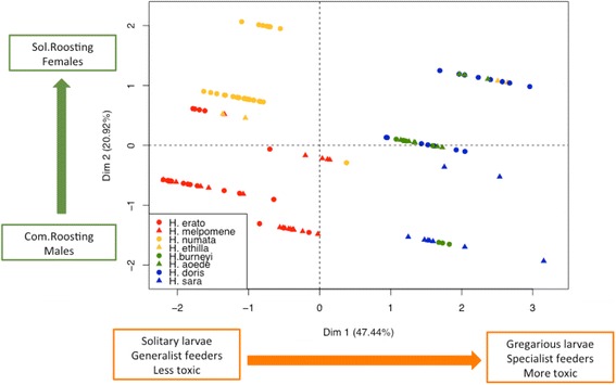
Fig. 4.

Individuals distributed in a Factor Analysis for Mixed Data (FAMD) plot for the first 2 dimensions. Different colours represent different mimicry rings (red is postman, orange is tiger, green is dennis rayed and blue is blue/yellow). Circles represent the individuals of the less toxic species of each pair, while triangles stand for individuals belonging to the most toxic species. The green and orange arrows represent the direction of the variation on the ecological and behavioural traits that we included in our analyses. In squares, the extreme phenotypes for each trait and the area in the plot where they are located
