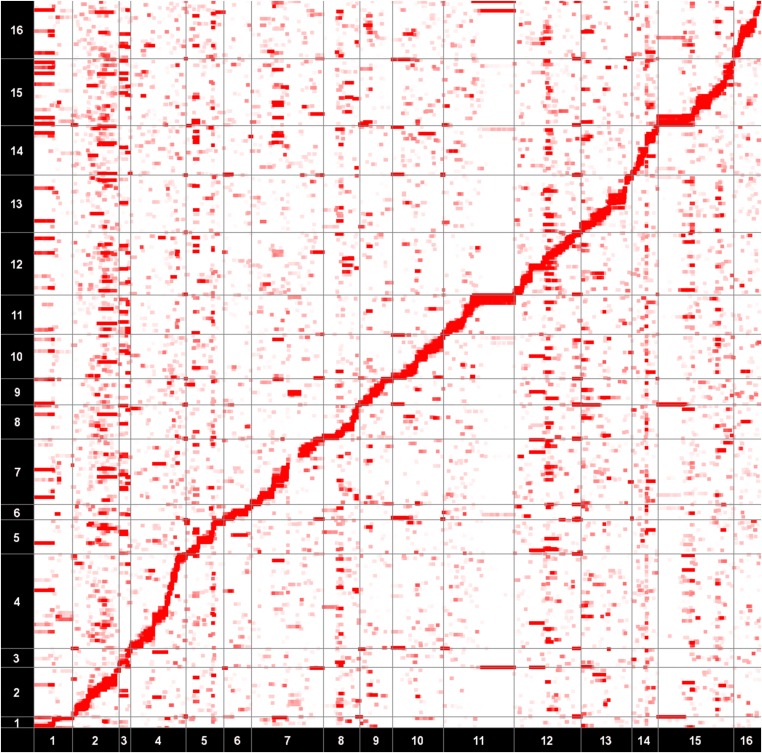
Figure 2.
An eQTL map of a real yeast data set. P-values are estimated from NICE (Joo et al. 2014). The x-axis corresponds to SNP locations and the y-axis corresponds to the gene locations. The intensity of each point on the map represents the significance of the association. The diagonal band represents the cis effects and the vertical bands represent trans-regulatory hotspots.

