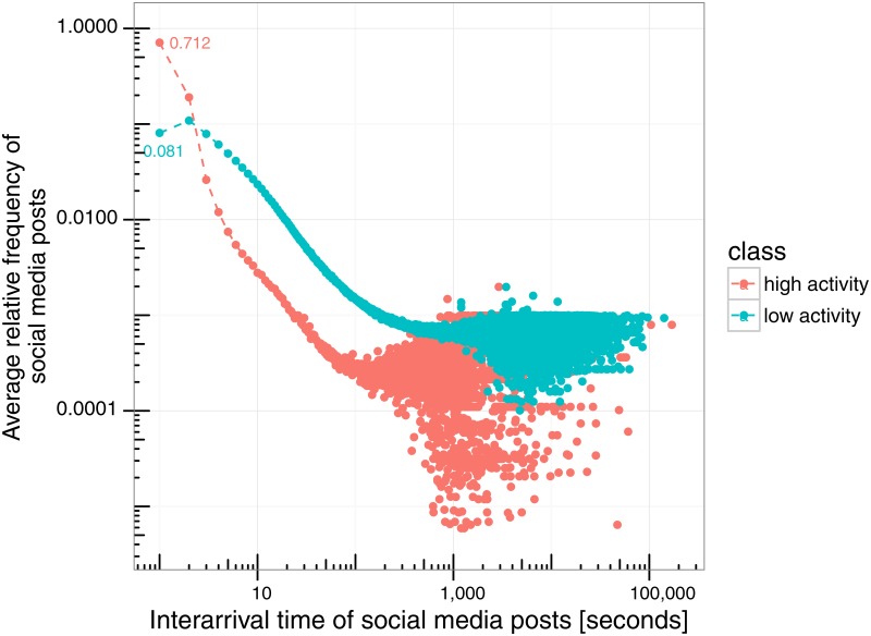
Fig 5. Scatter plots of the average relative frequencies of interarrival times for the high-activity and low-activity clusters of events (i.e., scatter plots of the histograms in Fig 4 in log-log scale).
y-axis represents the average relative frequency of social media messages and x-axis the interarrival time.

