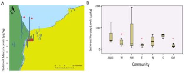
Figure 4. Sediment mercury concentrations (ug/kg).
A) Map of sediment mercury concentrations (ug/kg) from each of the study sites. Each site is represented by its average mercury concentration across the three sampling sessions. Asterisks denote a site at which mercury levels were above the US EPA lowest effect level for freshwater invertebrates. B) Box and whisker plot of sediment mercury concentrations (ug/kg) from the 7 study communities. The horizontal line represents the median, the bar represents first through third quartiles, and the whiskers represent the minimum and maximum values. Asterisks denote communities that differed significantly from Aamjiwnaang.

