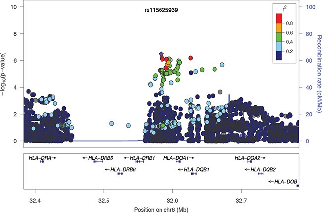
Figure 2. The regional association plot of rs115625939 in the MHC region.

Results are shown for SNPs in the region flanking 200 kb on either side of rs115625939 upon conditioning on the top 3 hits. The purple circle indicates the top SNP in each locus and the color of the dots represents the degree of linkage disequilibrium (based on r2) in relation to the top SNP. Recombination rates (cM/Mb) overlay the plots and are based on HapMap data http://hapmap.ncbi.nlm.nih.gov/downloads/recombination/2008-03_rel22_B36/rates/. Genes in the region are represented with arrow heads indicating the direction of transcription.
