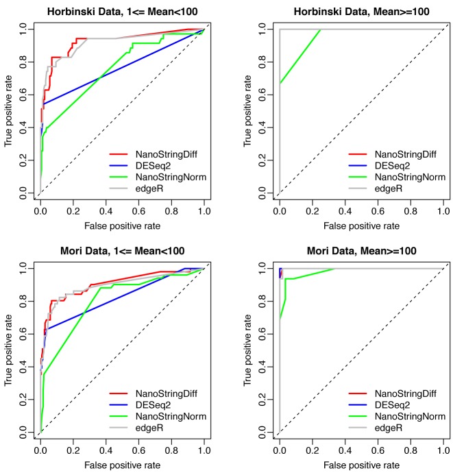
Figure 2.
ROC curves comparing different methods. Separate curves were generated for genes with average read count after adjusting background noise between 1 and 100 (left column), and higher than 100 (right column). Results were from data simulated based on Horbinski Data (first row) and Mori Data (second row) with three replicates.

