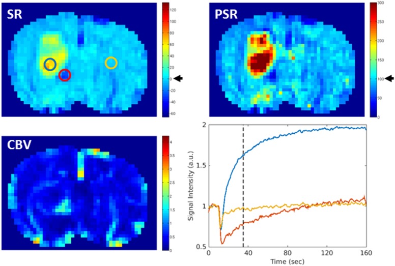
Fig 5. Maps of signal recovery (SR), percentage of signal recovery (PSR) and cerebral blood volume (CBV) in comparison.
Recovery of signal intensity at baseline level corresponds to a value of 0% on the SR map and 100% on the PSR map (black arrow). For better comparison the maps were scaled in a way that these two values marked the end of the first third of the entire value range of the respective map. Thus, with the used color coding, regions with a signal increase above baseline appeared yellow to red while those in which the signal intensity did not recover to baseline appeared blue on both maps. The signal-intensity time curve of selected regions of interest (ROI) is shown on the right, lower row. PSR and SR revealed a similar spatial distribution of regions with an increased capillary permeability, with highest level in the tumor center (blue ROI). Low PSR and SR were mostly accompanied by high CBV values (red ROI), whereas the signal intensity on the contralateral side went back to baseline (yellow ROI) within the observation time.

