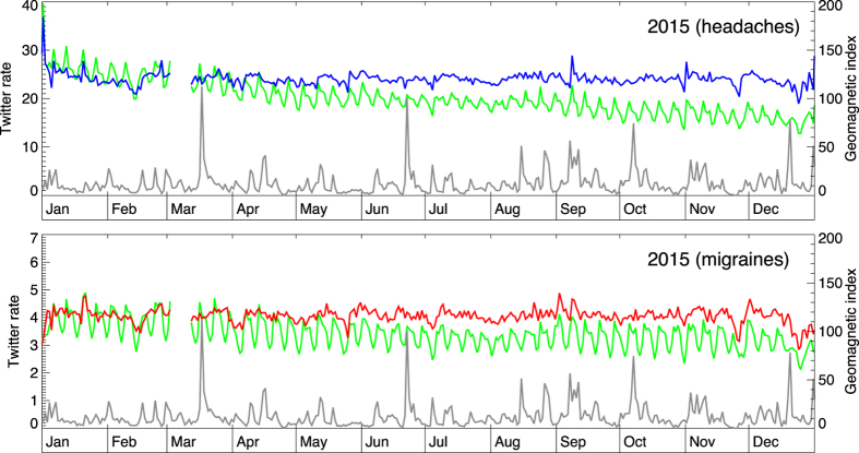
Figure 2. The change in geomagnetic activity (daily averages; gray curve) and the daily rate of Twitter messages (green lines) pertaining to headaches (up) and migraines (down) for year 2015.
Blue and red lines show normalized daily rates that account for the weekly modulation and the long-term trend of declining Twitter usage. There is no discernible link between geomagnetic events and symptom reporting.

