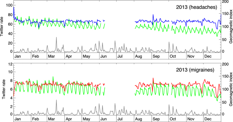
Figure 3. The change in geomagnetic activity (daily averages; gray curve) and the daily rate of Twitter messages (green lines) pertaining to headaches (up) and migraines (down) for year 2013.
Period of missing data pertains to Twitter API server change that required the modification of the harvesting software that was not immediately available.

