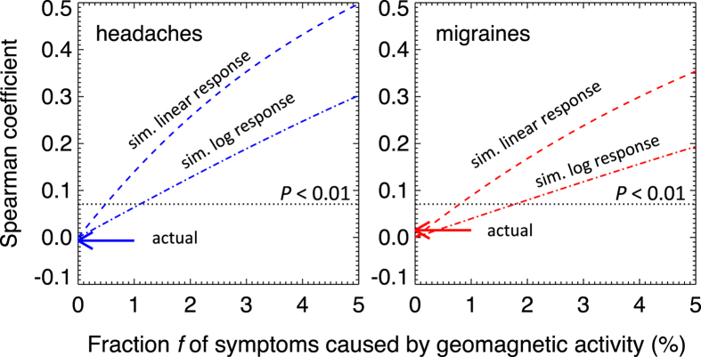
Figure 6. The sensitivity of the data and the method.
The graphs show the strength of the correlations after injecting an artificial signal in the data whereby some fraction of headache (left) and migraine (right) instances is due to geomagnetic activity. We model the response as either linear (a stronger response) or logarithmic (a weaker response). Regions above the dotted lines correspond to correlations that are statistically significant (P < 0.01). The intersect between the dotted and dashed lines shows that the data/method would have produced significant correlations even if only 1–2% of symptom instances were geomagnetic in origin. The actual correlation coefficients are consistent with 0% (arrows).

