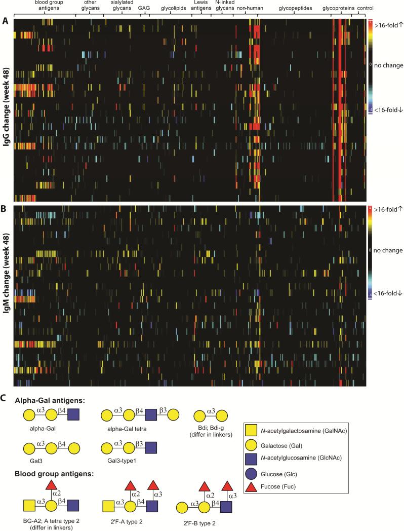
Figure 1.
Summary of antibody changes at week 48. Heatmaps of IgG and IgM changes are shown in panels A and B, respectively. Each row contains data from the same patient and each column contains data from the same antigen. Antigens are grouped by families. The magnitude of antibody changes are denoted by different colors: black (no or low change), yellow-red (signal increase) and cyan-blue (signal decrease). Structures of a few targeted antigens are shown in panel C.

