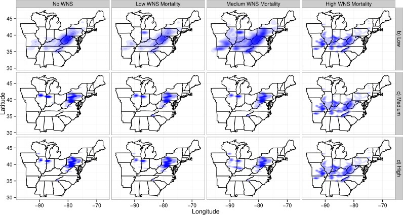
Figure 4. Map of maternity colonies lost under different exposure scenarios.
The figure is faceted on the x-axis by different WNS mortality scenarios. The figure is faceted on the y-axis by different wind turbine mortality rates. We only show the results from including turbines found within a 2-km buffer of the migratory pathway. We also did not plot the scenarios that only included take occurring along migratory pathways. The shading is the relative density of colonies lost. The density is subplot specific and only qualitative comparisons should be made across subplots. Furthermore, the area and shading of the density varies across plots because of the the shading algorithm used by ggplot2. This plotting program shrinks the density as the number of points increases and the variability among points decreases.

