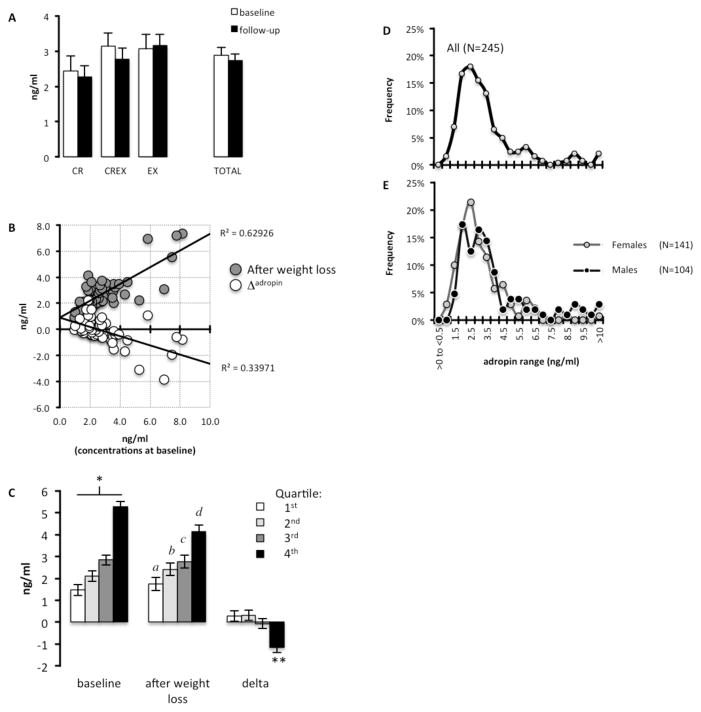
Figure 1. An inverse association between baseline plasma adropin concentrations and the effect of weight loss.
(A) Plasma adropin concentrations at baseline and after achieving 6–8% weight loss (“follow-up”) by calorie restriction (CR), calorie-restriction plus exercise (CREX) and exercise only (EX). White bars = adropin values at baseline; black bars = adropin values after weight loss.
(B) Scatterplot showing significant associations between baseline plasma adropin concentrations and concentrations after weight loss (follow-up) or the difference in concentration at follow-up from baseline (Δadropin). The data shown have been ln transformed. Grey circles = adropin values after weight loss; white circles = Δadropin
(C) Plasma adropin concentrations quartiled by ranking levels at baseline from low (1st quartile) to high (4th quartile). There was a significant interaction between weight loss and quartile, with the 4th quartile exhibiting a decline in plasma adropin concentrations. * P<0.005 between all quartiles; a P<0.005 vs. 3rd, 4th quartile; b P<0.005 vs. 4th quartile; c P<0.005 vs. 1st quartile; d P<0.005 vs. 1st, 2nd quartile; ** P<0.001 compared to the 1st and 2nd quartile, P<0.05 to 3rd quartile. The data show are ln transformed White bar = 1st quartile; light grey bar = 2nd quartile; dark grey bar = 3rd quartile, black bar = 4th quartile.
(D) Frequency distribution of plasma adropin data pooled from the current and previously published experiments (n=245).
(E) Frequency distribution of plasma adropin data by sex. The values for the x-axis are the same in panels C and D. Grey line with grey circles = females; black line with black circles = males.

