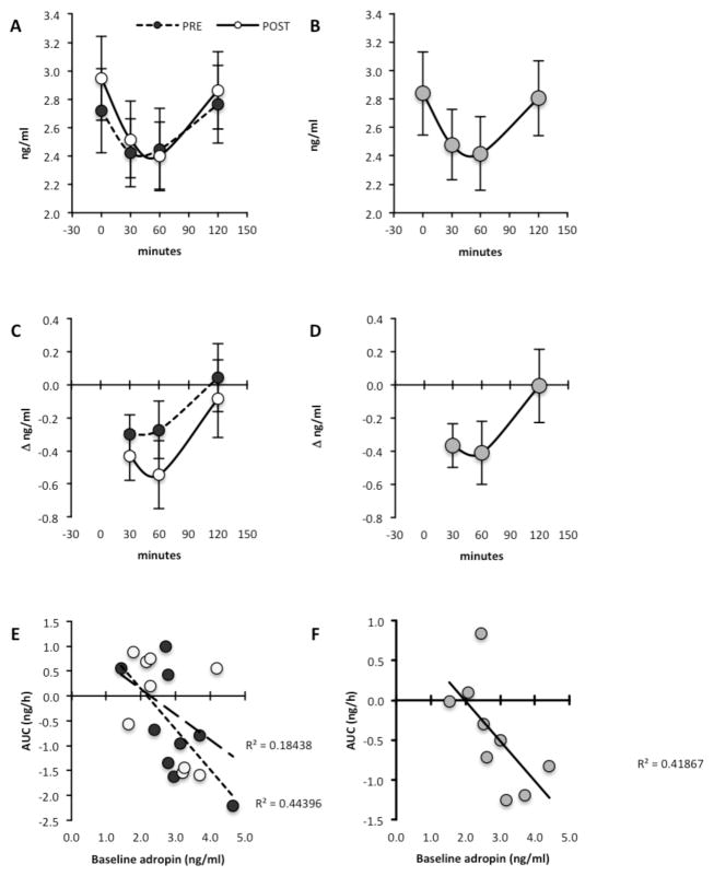
Figure 3. Reduced plasma adropin concentrations following a high carbohydrate (60% energy), low fat (30%) and low protein (10%) meal.
Actual values for the two arms of the study (A, C, E) and least square means of the overall meal effect (B, D, F) are shown. A and B show actual plasma adropin values, while C and D show the change in plasma adropin concentrations relative to baseline (Δadropin). A positive association between the area under the curve (AUC) for plasma adropin concentrations following the meal and baseline values is shown in E and F. White circles = post-exercise; Black circles = preexercise; grey circles = averaged meal effect.

