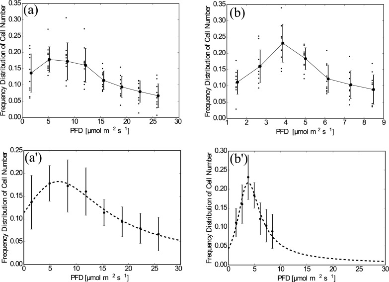
Fig 4. Plotted data of n′(x).
(a) Sheet A, raw data. The averaged values and the standard deviations are shown by points and bars, which are slightly shifted to the right to avoid overlapping with the raw data. (b) As in (a) but for Sheet B. (a)’ Sheet A, The curve fitted by Eq (11). The averaged values and the standard deviations are shown by points and bars. (b)’ As in (a)’ but for Sheet B and the horizontal range was set the same as for (a)’.

