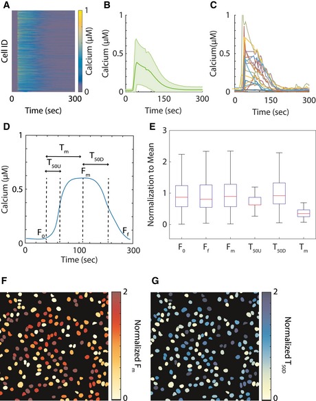
Figure 1. Calcium signal response heterogeneity.

-
AA matrix of single‐cell calcium response to ATP perturbation. Each row represents the calcium response of a single cell, and columns are time points. The heatmap figure contains data from a total of 1,904 cells.
-
BThe average calcium response of the population. The solid green line is the population average, and the light green shade is the standard deviation.
-
CExamples of single‐cell calcium data.
-
DExample of single‐cell calcium data with representative features of the basal value (F 0), time to reach half maximum (T 50U), time to reach maximum (T m), maximum value (F m), time to decay to half maximum (T 50D), and steady‐state final value (F f).
-
EBoxplots of representative time‐series features of calcium signals in the cell population, normalized to the average value of the particular feature. The red lines of the boxplots represent the median of the normalized values, and the ranges of the whiskers are defined to be 1.5 times the interquartile range (difference between 75th and 25th percentiles).
-
F, GSpatial distributions within one representative well of the maximum signal (F m) and the time to decay to half maximum (T 50D).
Source data are available online for this figure.
