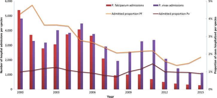
Figure 4.
Plasmodium falciparum and Plasmodium vivax hospital admissions in the period from 2000 to 2015. The left y axis shows number of hospital admissions corresponding to P. falciparum infections (red bars) or P. vivax (purple bars). The right y axis shows percent of hospital admissions due to P. falciparum infections (yellow line) or P. vivax infections (brown line).

