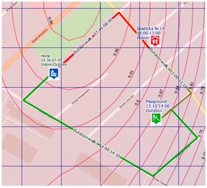
Figure 5.
Example of a child’s potential exposure at PM2.5 concentrations during a typical weekday (route: home–kindergarten no.14–playground–home) according to the usual program (morning–afternoon); red line—highest exposure; brown line—moderate exposure; green line—lowest exposure; curves represent isolines of PM2.5 concentrations for a specific selected hour; simulation performed by Rokidair cyberinfrastructure.

