
Fig. 5.
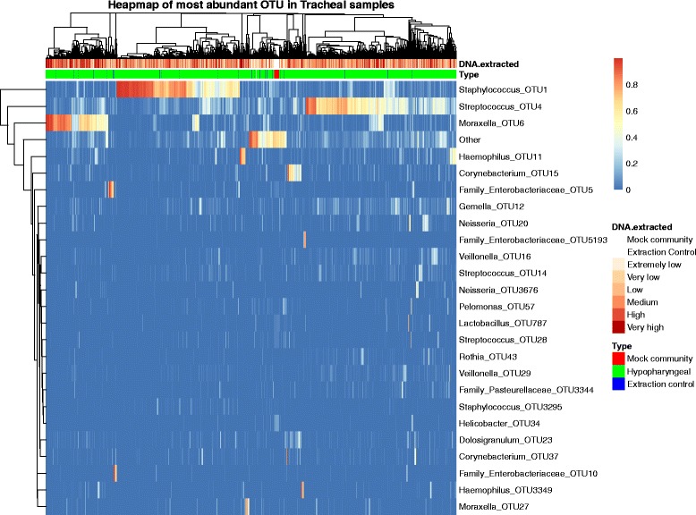
Heatmap of the 25 most abundant OTUs. The heatmap is annotated to show the amount of DNA extracted from each sample as well as the type of sample. Both samples and OTUs are clustered based on their Euclidian distances. The heatmap is colored by the log transformed relative abundance of each OTU within the samples