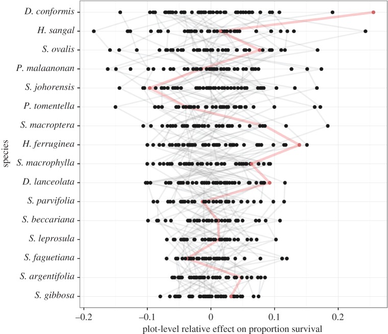
Figure 2.
The species-by-environment interaction for seedling survival in the 16-species mixtures. Points represent the average survival of a species in a plot relative to the overall average of that species (from the plot:species random effect)—so positive values show plots with better-than-average survival. Grey lines join particular plots, illustrating the varying performance of different species in the same conditions. The thicker line coloured in red gives one example: while this plot shows above-average survival for some species (e.g. D. conformis shows its highest survival) other species experience below-average survival. (Online version in colour.)

