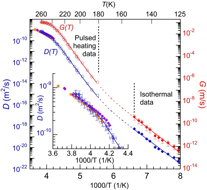
Fig. 3.
D(T) and G(T) vs. inverse temperature. For T ≤ 151 K, G(T) was measured isothermally (red diamonds). The red circles show scaled to facilitate comparison with the isothermal data. For the region where no data are available, the red dashed line shows a possible form of G(T) as the sum of two Arrhenius functions fit to the data on either side of that region. D(T) (blue line) was determined from G(T) (red line) using the Wilson–Frenkel model. The blue circles and diamonds show the corresponding experimental values for D(T) converted from G(T) via the Wilson–Frenkel model. The orange circles and purple diamonds show previous measurements of D(T) (30, 57). (Inset) Expanded view of D(T) near the melting point. The values of D(T) extracted from the pulsed-heating experiments agree with the previously measured values within the uncertainties.

