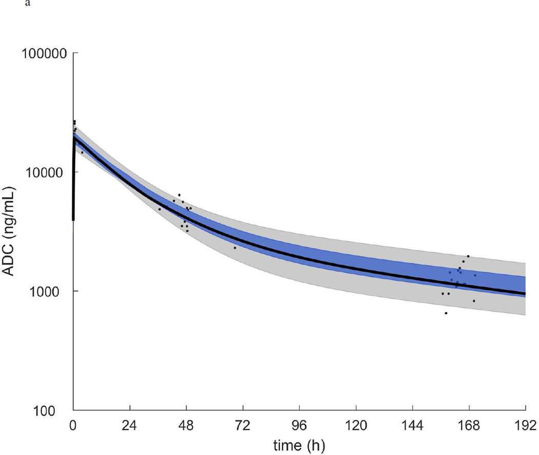
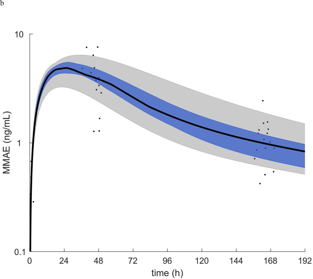
Figure 1.
a.) ADC plasma concentration vs time. b.) MMAE plasma concentration vs time. In each plot the symbols are the individual concentrations and the black curve, blue shaded region, and grey shaded region are the median, quartiles, and range of the post-hoc estimated individual concentration vs time curves respectively.


