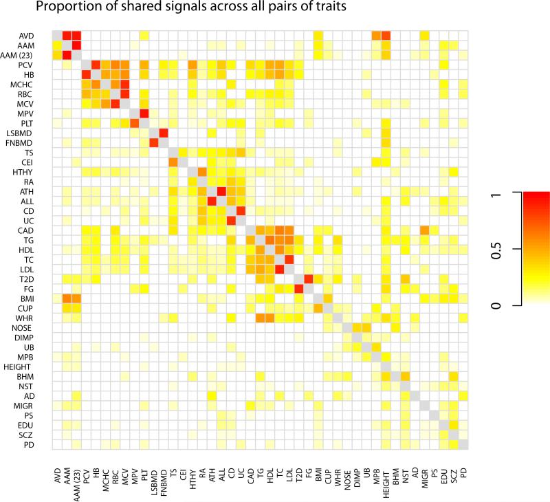
Figure 2. Heatmap showing patterns of overlap between traits.
Each square [i,j] shows the maximum a posteriori estimate of the proportion of genetic variants that influence trait i that also influence trait j, where i indexes rows and j indexes columns. Note that this is not symmetric. Darker colors represent larger proportions. Colors are shown for all pairs of traits that have at least one region in the set of 341 identified loci; all other pairs are set to white. Phenotypes were clustered by hierarchical clustering in R 74.

