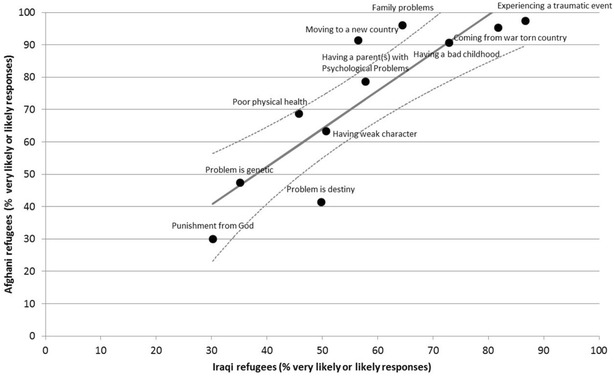
Fig. 1.

Comparison of the proportion of the likely causal beliefs between the two groups. Dots represent the observed values of the proportion of the likely responses within each sample. The solid line represents the regression line. Dotted lines represent 95% confidence interval around the mean predicted value
