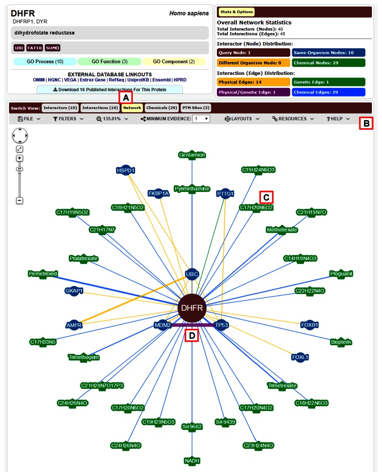
Figure 2.
New BioGRID network viewer. (A) The network tab in the ‘Switch View’ menu opens a network view for the selected query gene, as shown for human DHFR. (B) Users may export the network view as a figure file in PNG format, set filters that show or hide interactions, set thresholds for experimental evidence, and select from a number of layout formats. Explanatory text is provided under the help menu. (C) Node and edge colour indicates the interaction type and node size is proportional to its connectivity. In this example, green nodes represent chemicals and blue nodes represent proteins. When common names are not available, compounds are abbreviated by the chemical formula. (D) Yellow edges represent protein interactions, green edges represent genetic interactions, blue edges represent chemical interactions and purple edges represent both protein and genetic interactions.

