Figure 1.

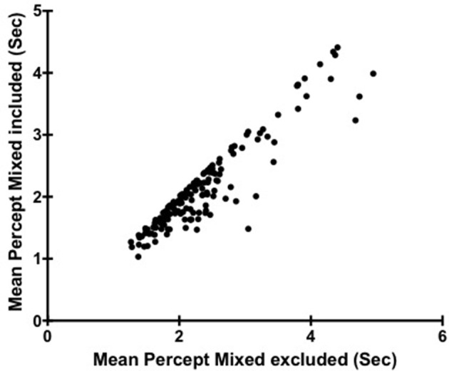
Scatter plot showing the relationship between Mean Percept Duration when Mixed is included and Mean Percept when Mixed is excluded. Each point corresponds to a different participant (N = 149).

Scatter plot showing the relationship between Mean Percept Duration when Mixed is included and Mean Percept when Mixed is excluded. Each point corresponds to a different participant (N = 149).