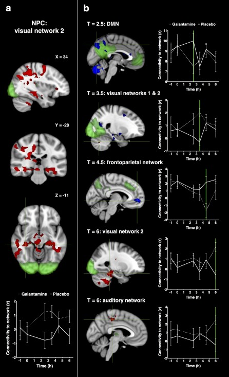
Figure 5.

Statistical maps of galantamine induced increases and decreases in functional connectivity. Networks are shown in green with increases in connectivity with the network in red and decreases in connectivity in blue (at P < 0.05, corrected). Figure (a) shows significant alterations in connectivity for all time points post dosing combined (with coordinates in mm). Figure (b) shows significant alterations in connectivity for each time point separately. Plots visualize the corresponding average time profiles of changes in functional connectivity for galantamine (dotted line) and placebo (continuous line) conditions (z‐values with standard errors of the mean as error bars). Coronal and axial slices are displayed in radiological convention (left = right). [Color figure can be viewed at http://wileyonlinelibrary.com.]
