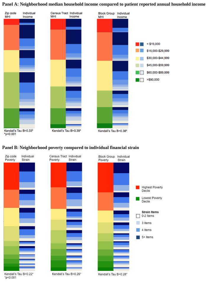
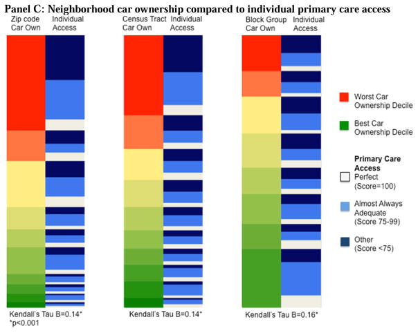
Figure 1.
Heat maps* comparing neighborhood characteristics to patient/household characteristics at three geographies (zip code, census tract, census block group) for A) Income; B) Poverty and financial strain; and C) Vehicle availability (“car own”) and primary care access.
Abbreviations: MHI – median household income
*The left column of each pair represents neighborhood-level data; the right column is caregiver-reported, patient/household data. Highest risk neighborhoods are depicted in red and lowest risk neighborhoods in green. Highest risk patients are depicted in dark blue and lowest risk in white.


