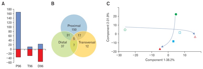
Figure 3.
Analysis of the metabolomic data obtained for each reactor at the 2 different simulated transit times. (A) Graphic representation of the proportion of ions which are significantly increased (blue) and decreased (red) in the 3 reactors with the simulated increase of transit time. (B) Venn diagram of the 259 ions which are significantly modified with the increase of the simulated transit time, showing shared ions among the different simulated anatomical parts. (C) Correlation matrix based Principal Component Analysis of metabolites profiles in each reactor (empty symbols, 48-hour transit time simulation; filled symbols, 96-hour transit time simulation; circles, proximal part; squares, transversal part; triangle, distal part). The arrows indicate the metabolic trajectory from the proximal part to the distal one at the 2 transit times.

