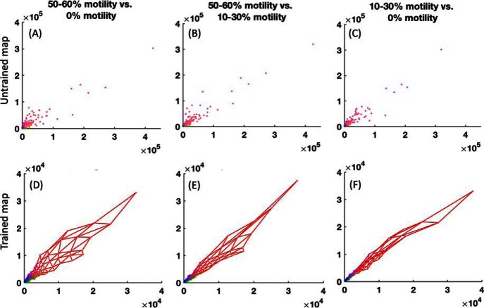
Fig. 8.
Correlation analyses of the sperm cell proteomic data set divided in three motility categories. Panel A, B, and C are datapoints in untrained map and D, E, and F are the trained map (50–60% motility (x axis) versus 0% motility (y axis) is panel A and D, 50–60% motility (x axis) versus 10–30% motility (y axis) is panel B and E and 10–30% motility (x axis) versus 0% motility (y axis) is panel C and F. Data points are the protein abundances with each point corresponding to one protein Id.

