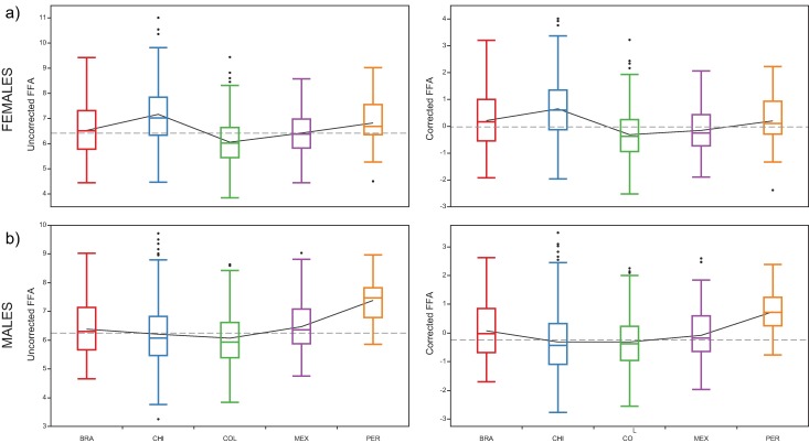
Fig 4. Boxplots of distribution of the FFA scores by country and sex.
The dotted line represents the grand mean, the continuous black line connect means among countries. a) Females, b) males. Black points represent outlier values. The left column plots represent raw FFA scores and the right ones the FFA scores corrected for the heterozygosity effects.

